Ori Volume Profile (Limited)Ori Volume Profile plots trading volume as a histogram on the price scale. The purpose of this script is to show potential of pine scripts. Parameters set with default values on this script and can't be changed since it is limited version. Default numbers for this script is last 500 bars for calculating and 25 rows for drawing histogram.
Pesquisar nos scripts por "volume profile"

Dynamic Volume ProfileThe result of standard volume profile is fix for a specified period of time. However, in this script the result is dynamic, because its calculated for every bar. In this script you can see the change of Point of Control , Value Area High and Value Area Low in real time.
Point of Control is the price level for the time period with the highest traded volume.
The area between value area low and value area high (green background) is the area where 70% of traded volume happen. You can customize this percentage value in input section.
Trader can customize input:
Period length
Number of rows
Percentage of value area
Reference:
www.tradingview.com

MTF Volume Profile & Signal Scanner v5The MTF Signal Scanner is a multi-timeframe trading system designed for futures trading, particularly optimized for MNQ (Micro E-mini Nasdaq-100). It combines volume profile analysis, EMA trend filtering, and a confluence scoring system to identify high-probability trade setups.

Multi-Timeframe Volume ProfileThe script has the volume profile VAH, VAL and POC for the previous week, overnight session, previous day and the current session.

Daily Volume ProfileThis indicator is identical to the Fixed Range Volume Profile,
except that it automatically fixes the range to a daily basis.
(SM3) Volume Profile Tool-kit1st pine script. It is a work in progress. I use this to mark previous day high and low value areas as well as overnight volume profile for NYSE open strategy.

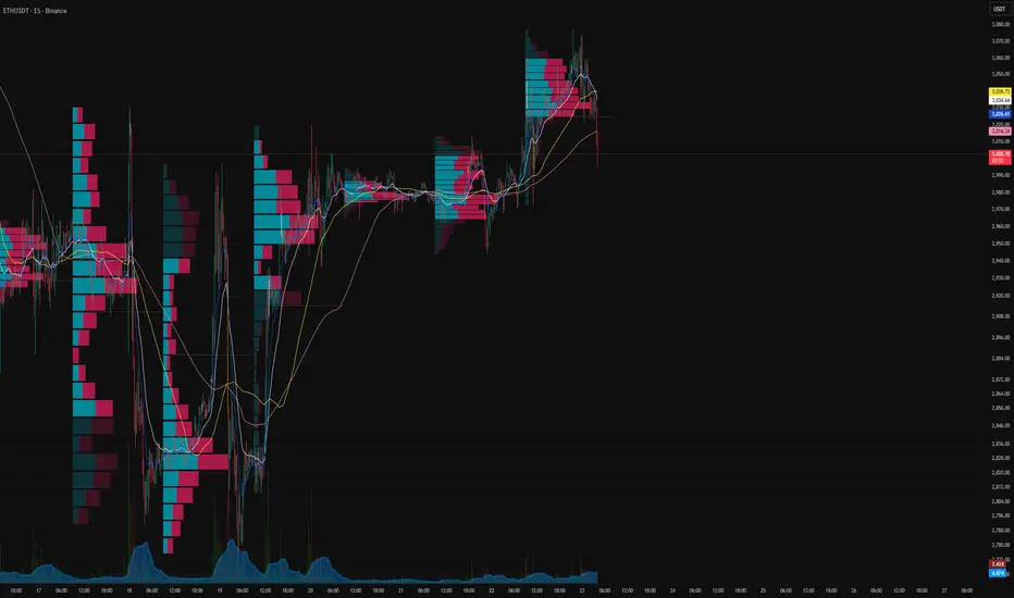
Session Volume Profile-1This indicator used to show volume profile, you can not change the code. You can suggest the changes
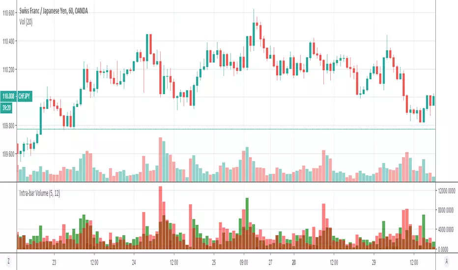
Volume Profile: Intra-bar VolumeThis indicator was developed as part of a free blog post tutorial on the Backtest-Rookies website for detailed code commentary, head over there.
Scope
The indicator shall attempt to do the following:
Look at a lower time-frame. E.g 5 minutes when on a 1-hour chart.
Create a function to loop through through candles and make an assessment.
If the candle it closed up, the volume will be categorized as buying volume. Conversely, if it closed down, the volume will be categorized as selling volume
The function will then be passed to the security() function to run on a lower timeframe.
All buying volume and selling volume from the lower time-frame shall be summed and displayed on the main chart.
Important Note
This indicator will not give you genuine buying or selling volume. It simply follows the assumption that if price closed up, there must have been more buyers than sellers and if it closed down we assume the opposite.
Usage
In order to use this indicator, users will need to calculate how many lower time-frame bars are contained in the time-frame on the main chart. So for example, the default settings are configured for the indicator to be run on the 1H chart. As a result, we need to set the "Bars on Lower Timeframe" input to 12. This is because there are 12 x 5-minute bars in 60 minutes.
Volume Profile: Date-Range ObservationI have refined the strategy developed by kv4coins , incorporating an additional option for the observation date range. Previously, when seeking a fixed date range—particularly to track data from the onset of an event-driven trigger up to the present—it was somewhat cumbersome. To address this, I added a new date selection feature to accommodate the need for observing specific time periods.

VP-Period with Previous Day Levels & Historical POC# Volume Profile with Previous Day Levels & Historical POCs
## Description
Comprehensive indicator combining Volume Profile analysis, previous day levels, and historical POC (Point of Control) levels for advanced technical analysis.
## Key Features
### Volume Profile
- **Customizable period**: 3 to 500 days
- **Calculation resolution**: 400 to 700 points
- **Current VPOC**: Point of Control line for current period
- **Volume bars**: graphical display of volume profile distribution
### Historical POCs
- **POC history**: up to 20 previous days
- **Time labels**: shows how many days ago for each POC
- **Dashed lines**: easy identification of historical levels
### Previous Day Levels (last 5 days)
- **High/Low**: daily highs and lows
- **Midpoint**: 50% level (High+Low)/2
- **Open/Close**: opening and closing prices
- **Progressive thickness**: day 1 thicker, decreasing for previous days
## Customization
- Fully configurable colors for each element
- Toggle on/off switches for every component
- Different line styles (solid, dashed, dotted)
## Usage
Perfect for traders using volume analysis and support/resistance based on previous daily levels. Ideal for identifying key zones and significant breakout points.

Volume Profile + Price Action Strategy (POC-based)This indicator combines volume dynamics, price action patterns, and a simplified Point of Control (POC) to highlight potential high-probability trade zones.
🔍 Key Features
POC-Based Logic
Plots the POC from the most recent closed 10-minute candle as a horizontal level for intraday structure.
Volume Spike Detection
Highlights unusual activity based on volume compared to the average of the last N candles.
Effort vs. Result Analysis
Based on Wyckoff-inspired logic:
Absorption: Large volume, small body → possible buyer/seller absorption
False Move: Small volume, large body → potential fakeout
Price Action Recognition Detects:
Inside Bars
Pin Bars
Engulfing Candles
Signal Highlights
🔺 Absorption Signals (below bar, teal triangle)
🔻 False Move Signals (above bar, orange triangle)
🔷 POC Line
⚙️ Customizable Inputs
You can control signal sensitivity with these inputs:
Volume Spike Multiplier
Raise to filter only extreme volume spikes
→ Recommended: 2.0 to 3.0 for cleaner setups
Absorption Body Ratio
Lower to detect only very small bodies (tight candles)
→ Try 0.3 to 0.4 for stricter absorption logic
False Move Body Ratio
Raise to catch only large candles on low volume
→ Use 2.0+ to filter weak moves
🧠 How to Use
Use in confluence with:
Support/Resistance
VWAP or moving averages
Session opens/closes
Best on 10-minute charts, but adjustable
✅ Signal Tuning Tips
Want fewer but cleaner signals?
Increase Volume Spike Multiplier: 2.5+
Decrease Absorption Body Ratio: 0.3
Increase False Move Ratio: 2.0+
Want more frequent signals?
Lower Volume Multiplier: 1.2–1.5
Raise Absorption Ratio: 0.6+
Lower False Move Ratio: 1.2–1.4
📊 Recommended Timeframe
Optimized for 10-minute charts
Works intraday, especially around session opens and POC re-tests
⚠️ Disclaimer
This script is for educational and informational purposes only. It does not constitute financial advice or a recommendation to buy or sell any asset. Past performance is not indicative of future results. Always do your own research and consult a licensed financial advisor before making trading decisions.
Use at your own risk.
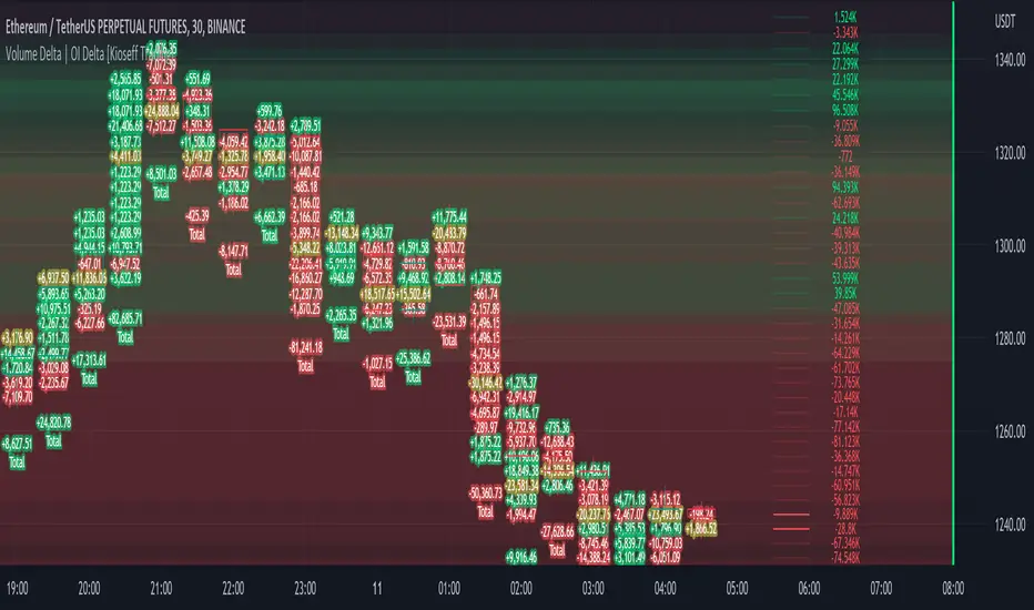
Volume Profile Volume Delta OI Delta [Kioseff Trading]Hello!
This script serves to distinguish volume delta for any asset and open interest delta for Binance perpetual futures.
The image above provides further explanation of functionality and color correspondence.
The image above shows the indicator calculating volume at each tick level and displaying the metric.
The label color outline (neon effect) is configurable; the image above is absent the feature.
The image above shows Open Interest (OI) Delta calculated - similar to how the script calculates volume delta - for a Binance Perpetual Future pair.
This feature only works for Binance Futures pairs; the script will not load when trying to calculate OI Delta on other assets.
Additionally, a heatmap is displayable should you configure the indicator to calculate it.
The image above shows a heatmap using volume delta calculations.
The image above shows a heatmap using OI delta calculations.
Of course, these calculations - when absent requisite data - require some assumptions to better replicate calculations with access to requisite data.
The indicator assumes a 60/40 split when a tick level is traded at and only one metric - "buy volume" or "sell volume" is recorded. This means there shouldn't be any levels recorded where "buy volume" is greater than 0 and "sell volume" equals 0 and vice versa. While this assumption was performed arbitrarily, it may help better replicate volume delta and OI delta calculations seen on other charting platforms.
This option is configurable; you can select to have the script not assume a 60/40 split and instead record volume "as is" at the corresponding tick level.
The script also divides volume and open interest if a one-minute bar violates multiple tick levels. The volume or open interest generated on the one-minute bar will be divided by the number of tick levels it exceeds. The results are, subsequently, appended to the violated tick levels.
Further, the script can be set to recalculate after a user-defined time threshold is exceeded. You can also define the percentage or tick distance between levels.
Also, it'd be great if this indicator can nicely replicate volume delta indicators on other charting platforms. If you've any ideas on how price action can be used to better assume volume at the corresponding price area please let me know!
Thank you (:
Volume Profile Visible Range (VPVR) with POC PriceThis script visualizes volume distribution for the bars currently visible on your chart, helping you identify key liquidity zones and high-traffic price levels.
Main Features:
・Dynamic Range: Recalculates automatically as you zoom or scroll.
・POC Price Label: Highlights the Point of Control (highest volume) with a clear price tag.
・Value Area (VA): Visually separates the most active trading zone (default 70%).
・Highly Flexible: Choose your preferred layout (Left or Right) and colors.
How to use:
1. Spot S/R Levels: Look for long bars (High Volume Nodes); these often act as strong support or resistance.
2. Monitor the POC: The Point of Control is a price magnet. Watch for reactions or retests at this level.
3. Low Volume Gaps: Price tends to move quickly through areas with very short volume bars.

Volume Profile Heatmap/ConcentrationThis is based on Colejustice's indicator. I just improved it so there's more clarity of the highly concentrated levels by making them more saturated and also reducing the noise of low saturated areas. There are also new settings that you can play with, such as:
1. Exponential Intensity
Making this higher will increase the saturation of high volume areas and lower the saturation of lower volume areas, basically, it changes the rate at which the saturation increases, so the levels are more visible
2. Visibility Threshold
Adjustes how much % of the highest volume areas will be visible. The default is 40%, so it doesn't show so much low-volume noise and gives the indicator more clarity.


Volume Profile - POC, VAH, VAL with ExtensionsMarks POC, VAH and VAL over selected time periods and extends the marker into the future for a selected period

Spike Base VPVolume Profile Spike Base:
Key Features:
Identifies M Period: Detects the 3:30-4:00 PM ET 30-minute candle (highlighted with light blue background)
Tracks Pre-M Extremes: Monitors the highest high and lowest low before the M period begins
Validates Extensions: Only marks spike bases when the M period extends at least 1 point (configurable) beyond the pre-M extreme
Visual Markers:
Green line = Bullish spike base (low extension) - the highest low before M period
Red line = Bearish spike base (high extension) - the lowest high before M period
Lines extend to the right for easy reference
Triangle markers show when valid spike bases form
Usage Notes:
Use on a 30-minute chart for /ES
Ensure your chart time zone is set to America/New York (or adjust the time zone)
The minimum extension is set to 1.0 points but you can adjust it in the indicator settings
Works best when the M period creates a true spike beyond recent price action
The indicator will draw horizontal lines at your spike base levels that persist on the chart, making them easy to reference for potential support/resistance during your day trading. (default is 5 days, adjustable from 1-30 days)

Volume Profile S/R + OB/OS + BreaksAs a support resistance trader I have created this indicator that shows SR lines. RSI over bought and over sold. I also added momentum candle.
It's easy to use. The arrows show over bought and over sold, that's where I start to be interested. Confirmation is if we are near a support/resistance area. shown as a red/green line.
Don't just trade the RSI, Be patient and only take the perfekt setups.
I't clean, it's simple it works.

Volume Profile - Previous Day Levels The green lines and area represent previous day Value Area. The values are not completely identical to Trading View default levels because of difference in calculation.
The white lines represent the min-max prices during the initial balance (9:30 to 10:30 EST). The diagnoal lines cannot be removed unfortunately.
You can also see same day evolving Valuea area and POC for momentum analysis.
DSMS - DeltaSurge Matrix Station - 1M Scalping [SurgeGuru]DSMS - DeltaSurge Matrix Station
HOW TO READ THE CHART
=====================================
This guide explains every visual element you see on the chart.
DSMS is a volume profile + order flow indicator built for 1-minute Bitcoin scalping.
It shows WHERE institutional money is sitting and WHERE price is likely to react next.
=====================================
1. THE VOLUME PROFILE (left side of chart)
=====================================
The colored horizontal bars extending left from the candles are the volume profile.
Each bar represents a price level (called a "bin") and shows how much volume traded there.
LONGER BAR = more volume at that price.
BAR COLOR tells you who is in control:
- Green/teal bar = buyers dominated that level (bullish delta)
- Red/orange bar = sellers dominated that level (bearish delta)
- The more intense the color, the stronger the imbalance
SPLIT BARS (bull/bear breakdown):
If enabled, each bar splits into two halves showing exact buy vs sell volume.
Top half = sell volume, bottom half = buy volume.
HEATMAP (wide faded bars behind the profile):
The large transparent boxes behind the profile bars are the heatmap.
They show the same delta information but stretched wider for quick visual scanning.
Bright = high conviction. Faded = low conviction.
=====================================
2. KEY PRICE LEVELS ON THE PROFILE
=====================================
POC (Point of Control):
The bin outlined with a bright border is the POC -- the single price level
with the MOST volume. Price tends to gravitate back to the POC.
A small label shows the POC price and context like "EQUILIBRIUM" or "BULL ATK".
POC FLASH LINE:
A short dashed cyan line appears at the POC when a bounce is detected.
Trigger conditions: price is at the POC, the current candle is bullish after
a bearish candle, and volume is at least 1.2x average. This signals that
the POC is acting as active support and price is reacting to it in real time.
VA HIGH / VA LOW (Value Area lines):
Two horizontal lines mark the top and bottom of the Value Area -- the price range
where approximately 70% of volume traded. These act as support and resistance.
- VA High = resistance when price is below, breakout level when price pushes above
- VA Low = support when price is above, breakdown level when price drops below
When a breakout happens, the line turns green (up) or red (down) and gets thicker.
=====================================
3. LABELS ON PROFILE BINS
=====================================
Each profile bin can show a small text label. These describe what is happening
at that specific price level. Here is what each label means:
ABS (with up/down arrow):
"ABS▼ 7b" = Absorption detected. Institutional players are absorbing selling
pressure at this level (likely accumulating). The "7b" means it held for 7 bars.
ABS▼ = absorbing sells (bullish). ABS▲ = absorbing buys (bearish).
FLOW (with arrow):
"FLOW↑" or "FLOW↓" = A flow shift happened here. The delta direction reversed,
meaning buyers took over from sellers or vice versa. This is a momentum change signal.
FAIL (with arrow):
"FAIL↑" or "FAIL↓" = A flow shift was detected but FAILED to confirm.
The reversal started but price did not follow through. Shown in orange.
Often means the opposing side absorbed the move.
INVAL / INVALID:
"INVAL" or "INVALID" = A previously confirmed flow shift was invalidated.
Price reversed back through the shift level, canceling the signal.
Shown in orange. Treat the original shift direction as no longer valid.
BULL EXH / BEAR EXH:
"BULL EXH" or "BEAR EXH" = Exhaustion zone. Extreme delta (above 65%) combined
with FADING volume. The dominant side pushed too hard and is running out of fuel.
Shown in gold. Often precedes a reversal. Higher delta + lower volume = more exhausted.
IMBALANCE RATIO (number:1):
"4:1" = The ratio of buy volume to sell volume (or vice versa) at this bin.
A 4:1 ratio means one side has 4x the volume of the other.
Only shown when the imbalance exceeds the configured threshold.
ICE:
"ICE" = Iceberg order detected in this bin. High volume traded but price barely
moved, suggesting a large hidden order was absorbing all the activity.
CONFL / CONF+ / CONF-:
Confluence detected. Multiple signals (structure + order flow) agree on direction.
CONF+ = bullish confluence. CONF- = bearish confluence.
CONFLICT:
Structure says one thing, order flow says another. Be cautious.
STK (with multiplier):
"STK x3" = Imbalance stack. Three or more consecutive bins all lean the same
direction. Shows institutional pressure building across multiple price levels.
OB (with arrow):
"OB↑" or "OB↓" = This bin overlaps with an active Order Block (see section 6).
FVG (with arrow):
"FVG↑" or "FVG↓" = This bin overlaps with an active Fair Value Gap (see section 7).
"uFVG↑" or "uFVG↓" = Same but for a micro-level FVG (smaller gap detected
within the profile structure rather than on-chart candle gaps).
uSR:
Micro structure level. A price level that has been tested multiple times with
high volume -- acts as local support or resistance.
EQUILIBRIUM / BULL ATK / BEAR DEF / etc:
Context labels that describe the state of the bin:
- EQUILIBRIUM = balanced buyers and sellers
- BULL ATK = buyers attacking with increasing volume
- BULL DEF = buyers holding but volume fading
- BEAR ATK = sellers attacking with increasing volume
- BEAR DEF = sellers holding but volume fading
CONFIDENCE SCORE (number at end of label):
Example: "ABS▼ CONFL "
The number in brackets is a confidence score from 0-100.
Higher = more signals agreeing. Above 70 is strong.
DWELL TIME:
"8d" at the end means price spent 8 bars dwelling at this level.
More time at a level = stronger support/resistance.
=====================================
4. ARROWS ON PROFILE BINS
=====================================
Small arrows may appear to the right of profile bars:
DELTA ARROWS (>> or ^^):
Show if buying/selling pressure is accelerating or decelerating.
">>" pointing up = bullish momentum gaining speed
">>" pointing down = bearish momentum gaining speed
VOLUME ARROWS:
Show if volume is increasing or decreasing at each level.
Up arrow = volume building. Down arrow = volume fading.
VELOCITY BANDS:
Small colored boxes to the right of the profile.
Green = volume accelerating. Red = volume decelerating.
Only appears on high-volume bins.
=====================================
5. CVD LINE (curved line inside the profile)
=====================================
The colored line running through the profile area is the CVD
(Cumulative Volume Delta) line.
It tracks the running total of buy volume minus sell volume across the session.
- Line going UP = buyers accumulating over time
- Line going DOWN = sellers accumulating over time
HOW THE LINE COLOR WORKS:
The line color is NOT random. It checks the CVD value against 5 moving averages
(EMA 8, 13, 21, 34, and 55). Each EMA that CVD is ABOVE scores +1. Each EMA
that CVD is BELOW scores -1. The total score (-5 to +5) sets the color:
+5 (above ALL 5 EMAs) = deep forest green -- strong bullish momentum
+3 to +4 = bright green -- solid bullish
+1 to +2 = light green -- lean bullish
0 = gray -- neutral, no clear direction
-1 to -2 = light red -- lean bearish
-3 to -4 = bright red -- solid bearish
-5 (below ALL 5 EMAs) = deep dark red -- strong bearish momentum
In practice: when the line shifts from red to green, it means CVD has crossed
above its moving averages -- buying pressure is accelerating. When green turns
red, selling pressure is taking over. A gray section means CVD is choppy and
sitting between its averages with no conviction.
CVD LABEL (at the right end of the line):
"CVD +1.2K +5"
First number = raw CVD value (+1,200 net buy volume)
Second number = confirmation count (+5 means 5 consecutive bars where the
adaptive reset system confirmed the bullish direction)
The label color uses a separate gradient based on the confirmation count:
Deep green = many consecutive bullish confirmations
Deep red = many consecutive bearish confirmations
Yellow/gray = few or mixed confirmations
=====================================
6. ORDER BLOCKS (OBs) - colored boxes on candles
=====================================
Order Blocks are zones where institutions placed large orders.
They appear as colored boxes around groups of candles.
ACTIVE OBs (not yet tested):
- Green/teal box = bullish OB (expect support when price returns)
- Red box = bearish OB (expect resistance when price returns)
- Solid fill, extends rightward from the origin candles
BROKEN OBs (breakers):
- Same colors but with a transparent fill and border outline only
- A bullish OB becomes a breaker when price closes below its bottom
- A bearish OB becomes a breaker when price closes above its top
- Once broken, the OB flips role: old support becomes resistance and vice versa
- A dotted midline shows the 50% level of the broken OB
- If price then closes through the breaker in the new direction, it is removed entirely
Two detection methods run simultaneously:
- Fast: simple 3-bar pivot swings for reactive OBs near current price
- Deep: ICS-style fractal depth swings for structural OBs from further back
The "Detection Depth" setting controls the fractal depth (Short/Intermediate/Long Term).
=====================================
7. FAIR VALUE GAPS (FVGs) - striped zones on candles
=====================================
FVGs are gaps in the price action where one side (buyers or sellers) was so
dominant that price skipped over a range. Price tends to come back and fill these gaps.
They appear as small striped/hatched boxes at the gap location.
- Purple-ish stripes = the gap zone
- Each individual stripe is deleted when price crosses through its midpoint,
so the gap visually erodes from the inside out as price fills it
- After 21 bars, remaining unfilled stripes fade to show the gap is aging
- Once every stripe is filled, the FVG is fully removed from the chart
- Maximum 30 FVGs tracked at once (oldest removed first if exceeded)
=====================================
8. MULTI-TIMEFRAME BOXES (2m / 5m / 15m)
=====================================
Colored boxes extending behind and slightly ahead of the current candles.
These show FVGs and Order Blocks detected on HIGHER timeframes (2-minute,
5-minute, 15-minute charts) projected onto your 1-minute chart.
HOW TO TELL THEM APART:
Border style:
- Dashed border = FVG (Fair Value Gap)
- Solid border = OB (Order Block)
Thickness and length:
- Thin border, extends 20 bars back = 2-minute timeframe
- Thin border, extends 30 bars back = 5-minute timeframe
- Thick border, extends 50 bars back = 15-minute timeframe
Color:
- Cyan/teal = bullish (expect support)
- Orange = bearish (expect resistance)
When your 1-minute price touches a higher-timeframe structure, it carries
more weight because institutions watch those levels.
=====================================
9. PREDICTIVE CONFLUENCE ZONES (projected boxes)
=====================================
These are the "ZONE S x3" and "ZONE R x2" boxes that project AHEAD of current price
(to the right of the last candle).
They appear when multiple structures from different sources cluster at the
same price area:
- 1m Order Blocks + 1m FVGs + 2m structures + 5m structures + 15m structures
The system scans all unmitigated levels, finds where they overlap, and projects
a high-probability reaction zone.
"ZONE S x3" = Support zone, 3 structures converge here (green box)
"ZONE R x2" = Resistance zone, 2 structures converge here (red box)
Higher count = stronger zone. These are the highest-conviction levels on the chart.
=====================================
10. SIGNAL LABELS ON CANDLES
=====================================
These labels appear directly on or near candles when specific conditions are met:
SWEEP LABELS (cyan/magenta bubbles):
Example: "VA High 8"
A liquidity sweep happened -- price wicked past a key level and reversed.
The name shows which level was swept. The number is a quality score.
Higher score = more reliable sweep. Cyan = bullish sweep. Magenta = bearish.
ICE (cyan/red squares):
Small squares below (bull) or above (bear) candles.
"ICE 2.3x" = Iceberg order detected. Volume was 2.3x average but price
barely moved. A hidden large order was absorbing all activity.
COILED:
"COILED " = Price has been compressing (low volatility) for 4 bars
while sitting near a wall of support/resistance. Like a spring ready to release.
Green = bullish coil (expect breakout up). Red = bearish coil (expect breakdown).
!!SR (with arrow and count):
"!!SR 5x" = A wall of 5 micro-structure levels stacked at this price.
Strong support (arrow down, green) or resistance (arrow up, red).
CVD DIV:
"CVD DIV (up arrow)" = Bullish CVD divergence. Price is making lower lows but CVD
is improving -- hidden buying.
"CVD DIV (down arrow)" = Bearish CVD divergence. Price making higher highs but CVD
declining -- hidden selling.
VA BREAK:
"VA BREAK (up arrow)" or "VA BREAK (down arrow)" = Price just broke out of the Value Area.
A thick green or red line extends forward showing the breakout level.
This is a high-momentum signal.
VOLUME SPIKE:
"x3.2" = Volume on this candle is 3.2x the average. Shows in magenta above the candle.
REJECT:
"REJECT (arrow)" = Price momentum is pushing into a wall of support or resistance.
Warns of a potential rejection/reversal at that wall.
=====================================
11. SEQUENCE PATTERNS (triangles)
=====================================
These track a full institutional flow sequence through 4 stages:
1. ABSORPTION = institution absorbs orders at a level
2. FLOW SHIFT = delta reverses confirming direction
3. SWEEP = liquidity grab confirms intent
4. BREAKOUT = Value Area breakout completes the pattern
PROGRESS LABELS (small, during build-up):
"SEQ:SHIFT" or "SEQ:SWEEP" = Sequence is building, currently at that stage.
COMPLETED SEQUENCE (large triangle + label):
Hot pink triangle (up or down) with "SEQ BULL " or "SEQ BEAR ".
The number is the sequence score. This is the highest-confidence signal in DSMS.
A full 4-stage institutional sequence just completed.
=====================================
12. CANDLE TECH (colored candle borders)
=====================================
Certain candles get a colored border and a small label:
- Green border = bullish pattern detected (hammer, bullish engulfing, etc.)
- Red border = bearish pattern detected (shooting star, bearish engulfing, etc.)
The label shows:
"R 5" = Reversal pattern, score 5
"(up arrow) 3" = Continuation pattern, score 3
Higher score = more confirming factors (CVD alignment, volume surge, trend direction).
Thicker border = stronger pattern.
=====================================
13. LIQUIDITY VOID LINES
=====================================
Yellow dashed horizontal lines extending left from the profile.
These mark price levels with very low volume -- gaps where price moved
through quickly without much trading. When price returns to these levels,
it tends to move through them fast again or react sharply.
=====================================
14. STATE OF THE ARENA TABLE (corner dashboard)
=====================================
The table in the corner of the chart is the real-time scoring dashboard.
It combines all signals into one weighted score from -100 (max bearish) to +100 (max bullish).
HEADER ROW:
Shows the overall market state and final score.
States: BREAKOUT, TRENDING, COMPRESSED, CONTESTED, or NEUTRAL.
COMPONENT ROWS (each scored -100 to +100, weighted into final score):
Delta Flow (10%) -- raw buying vs selling pressure on current bar
CVD Flow (10%) -- cumulative volume delta trend and EMA band position
Flow Shift (9%) -- recent delta direction reversals
Absorption (9%) -- institutional stop hunt detection
Sequence (8%) -- institutional flow sequence progress
Confluence (7%) -- structural + psychological signal agreement
OB/FVG (7%) -- nearest order block or gap bias
Sweep (7%) -- recent liquidity grab signals
MTF (6%) -- multi-timeframe alignment (2m/5m/15m)
Volume (6%) -- spike detection
Walls (6%) -- support/resistance cluster strength
Accel (5%) -- delta acceleration (2nd derivative of momentum)
Iceberg (4%) -- hidden institutional order detection
Candle (3%) -- pattern recognition score
POC Shift (3%) -- value area migration direction
The final score is the weighted sum, clamped to -100 to +100.
70+ or below -70 = STRONG conviction
40-69 = MEDIUM conviction
15-39 = WEAK conviction
Below 15 = no clear direction
Each row shows a text status, numeric score, and a visual bar made of blocks.
Green blocks = bullish. Red blocks = bearish. More blocks = stronger signal.
SIGNAL SECTION (bottom of table):
Shows the single highest-priority actionable signal right now.
"Key" = what the signal is based on
"Action" = suggested stance (BUY / SELL / HOLD / CAUTION)
"Watch" = what to watch for next
=====================================
QUICK REFERENCE - COLOR GUIDE
=====================================
Cyan/Teal ......... Bullish structures, support, buy signals
Red/Orange ........ Bearish structures, resistance, sell signals
Green ............. Bullish momentum, buyers winning
Red ............... Bearish momentum, sellers winning
Yellow ............ Liquidity voids, caution zones
Purple ............ FVG gap zones
Hot Pink .......... Completed sequence patterns
Magenta ........... Volume spikes, sweep highlights
Gold .............. Predictive zone projections
White text ........ All on-chart signal labels
=====================================
ALERTS
=====================================
DSMS has 6 built-in alerts you can set from TradingView's alert menu:
Flow Shift -- delta direction reversed at a price level
Volume Spike -- volume exceeds threshold with bin concentration
VA Breakout -- price broke out of the Value Area
Strong Confluence -- multiple signals align above the confluence threshold
Absorption -- institutional absorption pattern detected
Sequence Complete -- full 4-stage institutional sequence finished
To set an alert: click the alarm clock icon in TradingView, select DSMS as
the condition source, pick the alert type, and choose your notification method.
Each alert can be toggled on/off in the settings panel.
=====================================
SETTINGS OVERVIEW
=====================================
Everything is toggleable. The main groups in settings are:
Core Settings -- lookback period, number of bins, profile width
Display Options -- toggle heatmap, delta flow, volume breakdown, POC
1M Scalping -- CVD line, zoomed-out mode, volume trend arrows
Signal Settings -- enable/disable each signal type
Advanced Tuning -- compression bars, confidence thresholds
OB/FVG Settings -- order block depth, FVG stripe count, max blocks
Candle Tech -- pattern detection and scoring
Liquidity Sweeps -- wick ratio, volume requirement, score display
Tier 3: Flow Intel -- sequence patterns, multi-timeframe (2m/5m/15m), predictive zones
Colors -- customize every major visual element
State of the Arena -- table position, size, and which components to show

Quantum Tick-Time Nexus | Professional Analysis System |QTTN ProQuantum Tick-Time Nexus | Professional Analysis System (QTTN Pro)
An all-in-one volume-price analysis indicator that approximates tick-level market microstructure data using standard OHLCV candle data. It combines participation density mapping, delta approximation, liquidity flow tracking, absorption pattern detection, VWAP studies, and smart price levels into a single, fully customizable overlay.
🔍 WHAT THIS INDICATOR DOES
Most retail traders only have access to standard candle data (open, high, low, close, volume). Institutional-grade tools like footprint charts, real tick data, and order flow require expensive data feeds. This indicator bridges that gap by approximating tick-level insights from the data you already have.
It does NOT claim to replicate actual tick data. It uses statistical proxies — volume ratios, price-range relationships, candle anatomy, and z-scores — to estimate what is likely happening beneath the surface of each candle.
📦 MODULES INCLUDED
1 — Tick Approximation
Estimates relative trading activity per bar compared to recent history. A reading of 2.0x means roughly twice the estimated activity of the recent average. Four calculation methods are available: Volume-Weighted, Trade Density, Participation Index, and Hybrid Quantum (a composite of the other three).
2 — Participation Density Heatmap
Colors candles or the chart background based on how active a bar is relative to its recent history, using a z-score of combined volume and range. Hot colors mean statistically elevated activity. Cold colors mean quiet conditions. Choose from Colored Candles, Background Zones, Gradient Boxes, or Glow Effect display styles.
3 — Micro-Momentum Oscillator
A smoothed EMA of bar-to-bar price change, designed to detect subtle shifts in directional pressure before they show up on traditional momentum indicators. Includes automatic bullish and bearish divergence detection — flagged when price makes a new extreme but momentum does not confirm it.
4 — Volume Delta Approximation
Estimates net buying vs. selling pressure without bid/ask data. Four methods available: Price-Volume Correlation (uses candle direction and range), Candle Body Ratio (body size relative to range), High-Low Skew (where the close sits within the bar's range), and Composite Index (blends all three). Includes cumulative delta tracking and imbalance zone highlighting.
5 — Activity Regime Detection
Classifies the current market environment as HIGH, NORMAL, or LOW activity using a rolling average of combined volume and range ratios. Background coloring and boundary markers show exactly when the regime shifts. Useful for adjusting your trading approach — trend-following in high regimes, mean-reversion in low regimes.
6 — Liquidity Flow Visualization
Tracks the directional flow of volume-weighted price movement. Flow ribbons expand and contract around price to show where liquidity is pushing. Liquidity Pool markers flag bars where flow is statistically extreme (potential areas of institutional activity). Direction arrows show the prevailing flow.
7 — Absorption Pattern Detection
Flags candles that show signs of large orders absorbing selling or buying pressure: high volume combined with a small candle body and a disproportionately long wick. These patterns often precede reversals. Customizable sensitivity, body ratio threshold, and wick ratio let you dial in detection to your instrument and timeframe.
8 — VWAP Suite
Session VWAP with 2 standard deviation band pairs and a rolling Micro-VWAP. The session VWAP resets with each new session. The Micro-VWAP is a rolling volume-weighted average over a configurable lookback, useful for intraday mean-reversion setups. Band fills change color based on whether price is above or below VWAP.
9 — Smart Price Levels
Automatically plots approximate Point of Control (POC), Value Area High (VAH), Value Area Low (VAL), and dynamic support/resistance levels. POC is derived from volume-weighted moving average of price. VAH/VAL use volume-weighted highs and lows. Dynamic S/R tracks the rolling highest high and lowest low.
10 — Information Dashboard
A real-time panel (repositionable to any corner) showing all key readings at a glance: tick approximation, participation z-score, volume ratio, current regime, delta, cumulative delta, micro-momentum, liquidity flow, VWAP distance, absorption status, and divergence status.
⚙️ HOW TO SET IT UP
Step 1: Start with defaults. Add the indicator and look at your chart. Everything is enabled by default so you can see what each module does.
Step 2: Turn off what you don't need. Each module has its own "Enable" toggle. If your chart looks too busy, disable modules one at a time until you find your preferred combination. Most traders will want 2–4 modules active at once, not all 10.
Step 3: If your chart is lagging, enable Performance Mode under Master Controls. This disables labels, boxes, and background fills while keeping the core calculations and plot lines active.
Step 4: Pick a theme. Six built-in color themes are included (Quantum Dark, Solar Flare, Arctic Ice, Forest Depth, Sunset Ember, Midnight Violet), or choose Custom to use your own color palette.
Step 5: Tune sensitivity to your instrument. Volatile instruments (crypto, small caps) may need lower sensitivity values. Stable instruments (large-cap indices, bonds) may need higher values. The Sensitivity Multiplier under Tick Approximation and the various threshold settings under each module are your main tuning knobs.
📊 SUGGESTED MODULE COMBINATIONS
For Scalping / Intraday: Tick Approximation + Delta Approximation + Absorption Patterns + VWAP Suite. Focus on delta imbalances near VWAP bands and absorption signals for entries.
For Swing Trading: Activity Regime + Smart Levels + Liquidity Flow + Micro-Momentum. Use regime detection to know when the market is active enough to trade, levels for targets and stops, liquidity flow for directional bias.
For Volume Analysis: Participation Density + Delta Approximation + Liquidity Flow. Colored candles show when volume is elevated, delta shows who's in control, flow shows where the weight is moving.
For Reversal Hunting: Absorption Patterns + Micro-Momentum Divergence + Smart Levels. Look for absorption signals near POC/VAH/VAL with confirmed momentum divergence.
⚠️ IMPORTANT NOTES AND LIMITATIONS
This indicator uses approximations, not actual tick or order flow data. The delta, tick, and liquidity readings are statistical estimates derived from OHLCV data. They are directionally useful but not precise.
VWAP resets are based on cumulative calculations from the start of the chart's loaded data, not from the session open. For true session VWAP, ensure your chart loads data starting from the session open.
Best timeframes: Works on all timeframes but is most informative on 1m to 1H for intraday analysis and 1H to 1D for swing analysis. On very high timeframes (Weekly, Monthly), the microstructure approximations become less meaningful.
Max drawing limits: TradingView limits labels, lines, and boxes to 500 each. On lower timeframes with long history, some older markers may be automatically removed. Performance Mode reduces drawing count significantly.
This is an analysis tool, not a signal generator. It does not paint buy/sell arrows for blind entry. It gives you context about what is happening inside the market so you can make better-informed decisions.
All alert conditions are built in and ready to use. Go to the Alerts panel in TradingView and select this indicator to configure notifications for regime changes, absorption signals, delta imbalances, divergences, volume spikes, and VWAP crosses.
🎛️ FULL INPUT REFERENCE
SettingLocationWhat It DoesMaster EnableMaster ControlsTurns the entire indicator on/offVisual ThemeMaster ControlsSwitches color palette across all modulesPerformance ModeMaster ControlsReduces visual elements for speedApproximation MethodTick ApproximationSelects how tick activity is estimatedSensitivity MultiplierTick ApproximationScales all activity readings up or downLookback PeriodParticipation DensityHow many bars to use for activity baselineHigh Activity ThresholdParticipation DensityZ-score cutoff for flagging high activityVisual StyleParticipation DensityHow density is displayed (candles, background, boxes, glow)Momentum PeriodMicro-MomentumLookback for momentum EMASmoothing FactorMicro-MomentumAdditional smoothing passesCalculation MethodDelta ApproximationHow buying/selling pressure is estimatedImbalance ThresholdDelta ApproximationZ-score cutoff for flagging delta imbalancesDetection PeriodActivity RegimeLookback for regime classificationHigh/Low ThresholdsActivity RegimeCutoffs for HIGH and LOW regime labelsPool Detection SensitivityLiquidity FlowZ-score cutoff for liquidity pool markersDetection SensitivityAbsorption PatternsVolume spike multiplier for absorption detectionMax Body RatioAbsorption PatternsMaximum candle body size (as % of range) to qualifyMin Wick RatioAbsorption PatternsHow much longer the dominant wick must beBand MultipliersVWAP StudiesStandard deviation multipliers for VWAP bandsMicro-VWAP PeriodVWAP StudiesRolling lookback for the micro VWAP lineLevel Analysis PeriodSmart LevelsLookback for POC/VAH/VAL calculationDynamic S/R PeriodSmart LevelsLookback for dynamic support and resistance
Tags: volume analysis, order flow, delta, tick data, VWAP, market microstructure, liquidity, absorption, momentum, regime detection, participation density, volume profile, smart levels, divergence

VWAP Wave System ToolkitGENERAL OVERVIEW:
The VWAP Wave System Toolkit is an all-in-one trading indicator based on rules from Auction Market Theory. The indicator is built around Volume-Weighted Average Prices (VWAP), Initial Balance (IB) levels, session/composite volume profiles, low-volume zones, optional candle coloring, trade checklists, dashboard readings, and a watermark.
This indicator was developed by Flux Charts in collaboration with Chris Drysdale (Trader Drysdale), author of the best-selling book VWAP Wave System.
What’s the purpose of this indicator?
The VWAP Wave System Toolkit helps traders see where market value is forming, shifting, or being rejected across different timeframes. It’s built on the ideas of Auction Market Theory, which views the market as a continuous auction between buyers and sellers searching for fair value. The indicator combines VWAPs, Initial Balance levels, and volume profiles into one system that shows how price interacts with value throughout the day, week, and month. By combining short-term and higher-timeframe data, it helps traders understand when the market is balanced and when it’s starting to discover new price areas.
What’s the theory behind this indicator?
This indicator is built on Auction Market Theory, introduced by J. Peter Steidlmayer. The theory says that markets operate as continuous auctions, constantly seeking a fair price where buyers and sellers agree on value. When price stays within a narrow range and volume builds up, the market is balanced around a value area. When price moves away from that area, the market enters price discovery, searching for a new zone of balance. VWAPs represent an evolving measure of value, while Volume Profiles and Initial Balance visualize how the auction developed during each session. Low Volume Zones often show where the market moved too quickly to trade efficiently, making them potential areas of interest for future reactions. By combining these elements, the indicator provides a picture of how the market is auctioning and where value may shift next.
VWAP WAVE SYSTEM TOOLKIT FEATURES:
The VWAP Wave System Toolkit indicator includes 7 main features:
Initial Balance Levels
Multi-Timeframe VWAPs
Session Volume Profile
Composite Volume Profile
Low Volume Zones
Checklist
Watermark
Initial Balance Levels:
🔹What is the Initial Balance?
The Initial Balance (IB) is defined by the high and low prices that form within a specific time window. Typically, this time window is the first hour after the regular day trading session starts (09:30 - 10:30 AM EST).
The high and low formed during this window create the foundation for the day’s price structure. From these two points, the indicator automatically calculates several key reference levels that show how far price has extended beyond the initial range or where it may still be balanced. Understanding how these levels are derived and how to interpret them is essential to using the Initial Balance effectively.
🔹How Initial Balance Levels are calculated:
Once the IB window closes, the indicator plots a full set of reference levels derived from the IB range. These levels are:
IB High
IB Low
IB Midpoint
x2 High / x2 Low
x2 Midpoints (x1.5 High/Low)
x3 High / x3 Low
x3 Midpoints (x2.5 High/Low)
🔹IB High & IB Low
The IB High is the highest price reached during the IB session window, and the IB Low is the lowest price reached.
🔹IB Midpoint
The IB Midpoint is the average of the IB High and IB Low.
🔹x2 High & x2 Low
The x2 levels are calculated by projecting one full IB Range above and below the Initial Balance. The IB Range is the distance between the IB High and IB Low.
🔹x2 High Midpoint & x2 Low Midpoint
The x2 High Midpoint (x1.5 High) is the average of the IB High and x2 High. The x2 Low Midpoint (x1.5 Low) is the average of the IB Low and x2 Low.
🔹x3 High & x3 Low
The x3 High/Low levels are calculated by projecting two full IB Range above and below the Initial Balance.
🔹x3 High Midpoint & x3 Low Midpoint
The x3 High Midpoint (x2.5 High) is the average of the x2 High and x3 High. The x3 Low Midpoint (x2.5 Low) is the average of the x2 Low and x3 Low.
🔹Breaks & Retests:
For every Initial Balance level, the indicator automatically tracks when price retests or breaks through them.
A Break occurs when a candle closes above or below an IB level. When this happens, the indicator plots a small blue triangle.
A Retest occurs when price approaches and touches an IB Level, and then reverses in the opposite direction. When this happens, the indicator plots a small green or red triangle.
Green Triangle: Bullish Retest - Price comes down to a level, touches it, and continues up.
Red Triangle: Bearish Retest - Price comes up to a level, touches it, and continues down.
Both breaks and retests are plotted directly on the chart for every toggled IB level. Once detected, they remain fixed and are not repainted.
Other Settings:
🔹Shade IB Range
When enabled, this setting fills the area between the IB High and IB Low (IB Range). The fill helps visually separate the Initial Balance range from the rest of the session, making it easier to identify when price is trading inside or outside of the IB. The color and opacity can also be adjusted through the settings.
🔹Apply One Color
When this setting is enabled, all toggled IB levels use the same color instead of the user’s inputted colors.
🔹Levels Labels
When enabled, text labels that identify each IB level (for example, “IB High,” “x2 High,” or “x2.5 Low”) appear next to each level.
🔹Price Labels
When enabled, the indicator displays the real-time price value of each IB level directly on the chart. These labels update automatically as price changes or when the levels shift due to recalculation from a new session.
🔹Extend Levels Right
When enabled, all toggled IB Levels will be extended infinitely to the right of the chart.
🔹Align Text Right
This setting aligns all level and price labels to the right edge of the plotted line. When disabled, text labels will be aligned to the left edge of each level.
Multi-Timeframe VWAPs:
🔹Why does this indicator include VWAPs?
This indicator includes VWAPs because they show where the most trading activity has occurred within each timeframe, helping identify the market’s fair value area. According to Auction Market Theory, price moves between periods of balance and imbalance as buyers and sellers seek fair value. VWAPs represent those balance points where the majority of trading has taken place. By plotting the Intraday, Weekly, and Monthly VWAPs, the indicator shows how value shifts across different timeframes and whether the market is balanced or moving toward a new area of value.
🔹Intraday VWAP
The Intraday VWAP measures the average traded price for the current trading session and resets each day at market open. It shows where most of the session’s trading has taken place, acting as a real-time fair value line. When price trades near the Intraday VWAP, the market is considered balanced. When price moves far above or below it, the market is exploring new value areas.
🔹Candle Coloring:
The Intraday VWAP candle coloring highlights how far price is trading from the session’s average value using the first and second standard deviation bands as visual reference zones. This feature helps users see whether price is balanced around fair value or expanding into an overextended area.
When candle coloring is enabled, each candle’s color changes based on where it closes relative to the two standard deviation bands surrounding the Intraday VWAP. The first band represents one standard deviation (1.0 STD) and the second represents one and a half standard deviations (1.5 STD).
If a candle closes above the upper 1.5 standard deviation band, it is colored a brighter green, showing strong movement above fair value. Candles closing between the upper 1.0 and 1.5 standard deviation bands are a lighter green, showing moderate strength. If a candle closes below the lower 1.5 standard deviation band, it is colored a brighter red, showing strong movement below fair value. Candles closing between the lower 1.0 and 1.5 standard deviation bands are a lighter red, showing moderate weakness. Candles that close within the ±1.0 standard deviation range remain their normal color, showing that price is balanced near the session’s average.
Both the VWAP line and its bands can be customized in the Intraday VWAP settings. Users can adjust the VWAP line color, band colors, and fill transparency. The candle colors can also be modified. The band sizes (1.0 STD and 1.5 STD by default) can be changed through their input multipliers, allowing users to control the sensitivity of the zones.
Please Note: This candle coloring applies only to the Intraday VWAP
🔹Weekly VWAP
The Weekly VWAP measures the average traded price across the current trading week and resets at the start of each new week. It reflects the fair value area that has developed over multiple trading days, providing a broader view of market balance compared to the Intraday VWAP. When price stays close to the Weekly VWAP, it indicates that the week’s trading activity is balanced. When price consistently trades above or below it, the market is moving away from that balance and forming value in a new area.
Standard Deviation Bands:
The Weekly VWAP includes optional standard deviation bands. Users can toggle 1x and 1.5x STD bands. Users can also adjust the multipliers.
Customization:
All colors for the Weekly VWAP and its standard deviation bands can be changed in the indicator’s settings. Users can adjust the VWAP line color, band colors, and fill transparency.
🔹Monthly VWAP
The Monthly VWAP measures the average traded price for the current month and resets on the first trading day of each new month. It provides the broadest view of value within this indicator, showing where the majority of trading has occurred during the current month. When price remains near the Monthly VWAP, it reflects long-term balance.
Standard Deviation Bands:
The Monthly VWAP includes optional 1x and 1.5x standard deviation bands that can be enabled or disabled. In the settings, users can adjust the standard deviation multipliers.
Customization:
The Monthly VWAP line, band colors, and fill transparency can all be modified in the indicator’s settings.
🔹VWAP Dashboard
The VWAP Dashboard provides a quick real-time overview of how price is positioned relative to the Intraday, Weekly, and Monthly VWAPs. It is displayed directly on the chart and updates automatically with each new candle.
The dashboard is divided into five labeled sections:
Intraday
Weekly
Monthly
Weekly STD
Monthly STD
Intraday, Weekly, and Monthly Sections:
These three sections show whether price is currently trading Above or Below each VWAP.
If price is above a VWAP, that section displays “Bullish”
If price is below a VWAP, that section displays “Bearish”
Weekly STD and Monthly STD:
These sections display whether price is currently inside or outside the standard deviation bands of the Weekly and Monthly VWAPs.
When price is trading within the ±1.0 standard deviation zone, the dashboard output is “Balanced Market”
When price is above the upper standard deviation, price is extending up beyond the week’s or month’s fair value, and the dashboard output is “Bullish Price Discovery”
When price is below the lower standard deviation, price is extending down beyond the week’s or month’s fair value, and the dashboard output is “Bearish Price Discovery”
🔹What is a Balanced Market
A balanced market occurs when price is trading within the ±1.0 standard deviation range of a VWAP. This shows that buyers and sellers are in general agreement on value, and trading activity is taking place around the fair value area. In this state, price tends to rotate around the VWAP rather than trend strongly away from it. Balance reflects stability in the auction process, where neither side is dominant and value is being built at current prices.
🔹What is Bullish Price Discovery
Bullish Price Discovery occurs when price trades above the upper standard deviation of a VWAP. This indicates that buyers are accepting higher prices and that value may be shifting upward. In terms of Auction Market Theory, the market is moving away from balance as it searches for a new fair value area above the prior range.
🔹What is Bearish Price Discovery
Bearish Price Discovery occurs when price trades below the lower standard deviation of a VWAP. This shows that sellers are accepting lower prices and that value may be developing beneath the prior area of balance. The market is moving out of equilibrium as participants test lower prices to find new fair value.
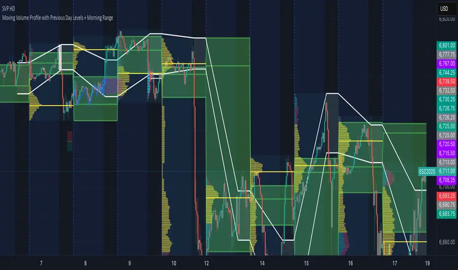
Session Volume Profile:
🔹Why this feature is included:
The Session Volume Profile is included to show where trading activity occurred within each session. It visually represents the volume traded at each price, helping to identify where market participants considered value to be. This ties directly to Auction Market Theory, which views markets as auctions seeking balance between buyers and sellers. The profile highlights those balance areas and shows where volume thins out, helping distinguish between value areas and areas of rejection.
🔹How is the Session Volume Profile calculated and displayed:
At the start of each selected session window, the indicator creates a new volume profile and tracks every bar in that session. For each candle, it saves the high, low, open, close, volume, and time. When the HD (High Definition) setting is enabled, and your chart is between the 1-minute and 30-minute timeframes (recommended), the indicator requests lower-timeframe data and feeds the profile with 1-minute candlesticks for more detail. The running session high and low define the vertical bounds of the volume profile. That span is split into a fixed number of rows. Each row represents a price slice. For every bar and every price row, the indicator checks whether the bar’s high-low range touches that row. If it does, it adds part of the bar’s volume to that row. The allocation uses a step-to-bar-size ratio, so that narrow bars do not overload a tall row and tall bars contribute proportionally across all rows they cross. If the bar closes above its open, that row’s “up” volume bucket is incremented. If it closes below its open, the “down” bucket is incremented. After all bars are processed, the row with the highest total becomes the Point of Control (POC). Starting from that row, the indicator expands upward and downward, adding adjacent rows until the cumulative total reaches your Value Area percentage. The upper boundary is Value Area High (VAH), and the lower boundary is Value Area Low (VAL).
For rendering, each price row becomes a horizontal box drawn from the session start time to a length proportional to that row’s volume versus the session’s maximum row volume. If you choose “Up / Down” volume, the row is split into two adjoining boxes that show the up and down portions. If you choose “Total,” a single box is drawn to the total length. If you choose “Delta,” the length reflects the absolute difference between up and down. The POC is drawn as a line across the row midpoint. VAH and VAL are drawn at the exact prices of the top and bottom value rows. While a session is open the profile keeps updating as new bars form. When the session ends, the script fixes its start and end and stops changing that profile. To avoid any issues with drawing limits, the indicator only renders the two most recent session volume profiles.
Settings:
🔹Enabled
Turns the Session Volume Profile on or off. When disabled, no session profiles, lines, or volume boxes are displayed.
🔹HD
Stands for High Definition. When enabled, the indicator requests data from the 1-minute timeframe to build a smoother, more detailed volume profile. This produces finer row distribution and more accurate POC, VAH, and VAL positioning, especially on higher chart timeframes.
🔹POC Line
Toggles the visibility of the Point of Control line. The POC represents the price level with the highest traded volume in the session. It’s drawn horizontally across the chart at that price, and its color can be customized in settings.
🔹VAH
Controls the display of the Value Area High line. The VAH is the top boundary of the range that contains the specified percentage of total traded volume (default 70%). It marks where volume starts to thin out above fair value. Users can turn it on or off and customize its color.
🔹VAL
Controls the display of the Value Area Low line. The VAL is the lower boundary of the value area and marks where volume thins out below fair value. Its visibility and color can also be customized.
🔹Session
This setting allows users to define the start and end time of the trading session used to calculate the session volume profile. Only bars within this time window are included in the volume profile. When a session ends, the volume profile locks, and a new one begins automatically when the next session begins based on the user’s input.
🔹Volume
Controls how the histogram rows are displayed:
Up/Down: Splits each price row into two parts: one for bullish candles (Up volume) and one for bearish candles (Down volume). This helps visualize buying versus selling pressure at each price.
Total: Combines both Up and Down volume into a single-colored bar for each price level. Since direction isn’t separated, this view focuses purely on where trading activity was concentrated, regardless of which side was in control. A tall bar means strong participation and interest at that price.
Delta: Displays the difference between up and down volume (Up/Down) for each row, highlighting which side controlled that price area.
🔹Value Area Volume
The Value Area Volume setting defines how much of the total session volume is considered the “value area.” By default, it’s 70%, meaning the indicator finds the price range where 70% of all trading took place during that session. This area is where buyers and sellers agreed the most on price, also known as the fair value zone.
If you increase the percentage (for example, to 80%), the value area becomes wider and includes more of the session’s trading range. Lowering it (for example, to 60%) makes it narrower, focusing only on the prices with the heaviest activity.
🔹Row Size
The Row Size controls how detailed the volume profile looks. It decides how many price levels (rows) the profile is divided into. Smaller values make the profile smoother and easier to read but less precise. Larger values add more detail and show exactly where volume clustered, but they can make the profile look denser.
The maximum value is 450 rows, and the minimum value is 5 rows. Higher values (especially above 200) can make the volume profile appear more detailed but may also cause performance issues or partial rendering on TradingView charts due to the platform’s drawing object limits. For most users, values between 50–150 give a good balance between clarity and performance.
25 Rows vs. 200 Rows:
Composite Volume Profile:
The Composite Volume Profile shows how volume is distributed across a larger selected range instead of just one session. It helps traders see where the most trading activity has taken place over multiple days. This gives a picture of long-term balance areas and important price zones that have repeatedly attracted buyers and sellers.
The Composite Profile uses the same base logic and visual settings as the Session Volume Profile, including POC Line, VAH, VAL, Volume Type, Value Area Volume, Row Size, and Colors. Any customization applied to those settings also affects the Composite Profile, ensuring a consistent appearance across both features.
🔹Session Count Setting:
This setting controls how many past sessions are merged into one composite volume profile. For example, if the Session Count is set to 5, and each session represents one trading day, the profile combines data from the last 5 trading days. A “session” refers to the time window defined in the Session Volume Profile settings.
🔹How is the Composite Volume Profile used?
In Auction Market Theory, markets move through phases of balance and imbalance as traders agree on value before moving to explore new ones. The Composite Volume Profile shows where that long-term balance has formed. Large, wide areas on the profile indicate zones where multiple sessions agreed on value. Thin areas show prices that were quickly rejected, where less time and volume were traded. Combining short-term session profiles into a composite helps identify when the market is holding near established value or entering new price discovery, confirming transitions between balance and price discovery.
Low Volume Zones:
🔹What are Low Volume Zones?
Low Volume Zones (LVZs) are price areas where trading activity was minimal compared to surrounding levels. On a volume profile, they appear as thin “valleys” between two high-volume “peaks.” These valleys show where the market moved too quickly for significant two-way trade to occur. In Auction Market Theory, they represent inefficient areas, meaning the market didn’t find fair value, so price either skipped through or rejected those levels.
🔹How are Low Volume Zones found?
The indicator identifies Low Volume Zones (LVZs) directly from Session Volume Profiles (SVPs) by analyzing the shape of its volume distribution. Each SVP is built from a series of horizontal rows, where each row represents the total traded volume within a narrow price range. The longer the row, the higher the trading activity at that price.
The indicator first locates the two largest high-volume peaks on the profile. These peaks represent the strongest areas of market activity. Once these two main peaks are found, the indicator looks on both sides of each peak for the lowest-volume row in the surrounding area. Those small-volume dips define the boundaries of the Low Volume Zones.
Each high-volume peak can therefore generate two LVZs (one above and one below it), resulting in a maximum of four Low Volume Zones per volume profile. If two LVZs overlap or share the same price range, they are automatically merged into a single larger zone, which may reduce the total count to three or fewer.
🔹How are Low Volume Zones used?
Low Volume Zones (LVZs) mark areas where the market previously traded with little participation. In Auction Market Theory, these zones represent inefficient price areas where buyers and sellers failed to agree on value. When price returns to an LVZ, it may act as an area where price tends to react differently due to lower previous trading activity. If the market still sees that area as unfair, price will reject it and reverse quickly. If the market now accepts that price level, volume builds and price moves through it smoothly as the auction seeks new balance. Traders use LVZs to identify where price may react sharply or move quickly through thin areas. When price approaches a zone from above or below, it signals potential rejection or continuation.
🔹LVZ Breaks and Retests
The indicator automatically tracks how price interacts with every detected LVZ.
A Break occurs when price fully moves through the entire LVZ and closes past it. When this happens, the indicator plots a small blue triangle.
A Retest occurs when price touches an LVZ and reverses away, showing rejection. When price comes down to a level, taps it, and continues up, it’s considered a bullish retest, and a small green triangle is plotted. When price comes up to a level, taps it, and continues down, it’s considered a bearish retest, and a small red triangle is plotted.
🔹LVZ Settings
Enabled:
Toggles LVZ detection and visualization on or off.
Realtime:
Allows LVZs to form dynamically as the current session develops, updating live as volume builds or thins out. When disabled, zones only appear once the session closes.
Please note: When this setting is enabled, zones may update or shift while the current session is still forming. Because the Session Volume Profile is continuously recalculating with new data, both the volume distribution and detected zones can change until the session closes.
Row Pivot Length:
Controls how far above and below each price row the indicator looks when identifying the highest and lowest volume points that define each Low Volume Zone. Larger values make the indicator compare a wider range of rows, while smaller values keep the analysis closer to each row’s immediate area.
Last SVPs:
Defines how many recent Session Volume Profiles are used for LVZs. For example, setting it to 3 limits LVZ detection to the last three sessions only.
Retests and Breaks:
Enables or disables the display of the retest and break markers described above.
Checklist:
The Checklist is a manual on-chart dashboard that allows traders to keep track of specific market conditions before entering a trade. Each checklist item can be toggled on or off in the indicator’s settings. When enabled, a checkmark emoji appears next to that item on the dashboard. When disabled, an X emoji appears next to that item.
This feature is designed to help traders visually confirm important steps in their process, such as reviewing trend direction, VWAP alignment, or session context. The checklist can also be repositioned anywhere on the chart using the “Location” setting for better visibility and layout preference.
Watermark:
The Watermark feature displays key chart information directly in the background, including the current ticker symbol, selected timeframe, and date. The watermark’s size, color, and transparency can be adjusted in the settings.
UNIQUENESS:
The VWAP Wave System Toolkit is unique because it brings every part of Auction Market Theory to the chart. It shows how value builds and shifts by combining Initial Balance levels, multi-timeframe VWAPs, and volume profiles. The indicator automatically marks low-volume zones where the market moved too quickly, highlights breaks and retests, and tracks how price interacts with fair value across sessions, weeks, and months. Every feature works together to give a simple view of balance, imbalance, and value development as the auction unfolds.
